Tuesday 26 February 2013

Adaptation: Design with Colour

I've coloured in my design concept using the colour palette I had done earlier. It's tough to say whether the colours are working or if it's just too much.


Monday 18 February 2013

Maya - Curve Emitter: Water Foam

Not sure if we had to render this as an animation but it didn't look right when I did anyways so here's a still.


Saturday 16 February 2013

Adaptation: Design Concepts 3

I've had a little gap in posts but I was constructing a way to make the designs come together as a whole and here it is. The majority of people liked the cut out spherical designs from my previous set since it made more of an impact so I adapted it to the trees. The story Elge the Queen of Serpents has five different trees into which the mother and children transform but instead of accurately replicating the tree I merely tried to grasp the essence of each tree. In Alan's words "a tree is a tree", so each design below merely imitates the form of its respective tree. Also I've given each tree trunk a separate pattern; the boys have sharp angular patterns, the mother has egg shaped patterns representing her children and also the bottom half of a snake, and the little girl is more frail than the rest and has a fire like design coming from the bottom representing her betrayal.


Monday 11 February 2013

Maya - Volume Emitter: Smoke

Adaptation: Design Concepts 2

Same as previous design concepts, I'm focusing on different root, body and canopy designs while integrating patterns and carvings traditional to folk art. I'll start moving on to designing the surroundings next while incorporating certain attributes from each of these designs.


Adaptation: Design Concepts

I've now started moving on from colours to the actual style of the the scene. Firstly I want to get the design of the trees down so that the rest of the scene can evolve around them. I'll be doing a mix and match with these designs as I have a second sheet on the way; my main three areas of concentration are the roots, tree trunks and the canopies. Again the scene will need to look like it's carved so I'm adding in flat blocky surfaces for the canopies to avoid modelling leaves. The trunks can be intricate to a certain extent and I'm still working on the root style because I want them to extend downward into the serpent kingdom.


Saturday 9 February 2013

Adaptation: Colour Palette

I've taken certain colours from my previous colour paintings and applied them in a manner I think would be useful to me. This is the first time I've done a colour palette like this one so if anyone has any opinions or advice feel free to share.
Next I'll be moving on to style design, so shaping the scene into a carving and then hopefully soon after I'll be able to start my final concepts.


Adaptation: Influence Maps

I hadn't uploaded any proper influence maps yet for my colour schemes and design style but here they are.

My first map represents the colours I want to use for the over world where the trees reside. I want to incorporate natural green undertones with vivid red highlights and a pleasant golden sunlight.

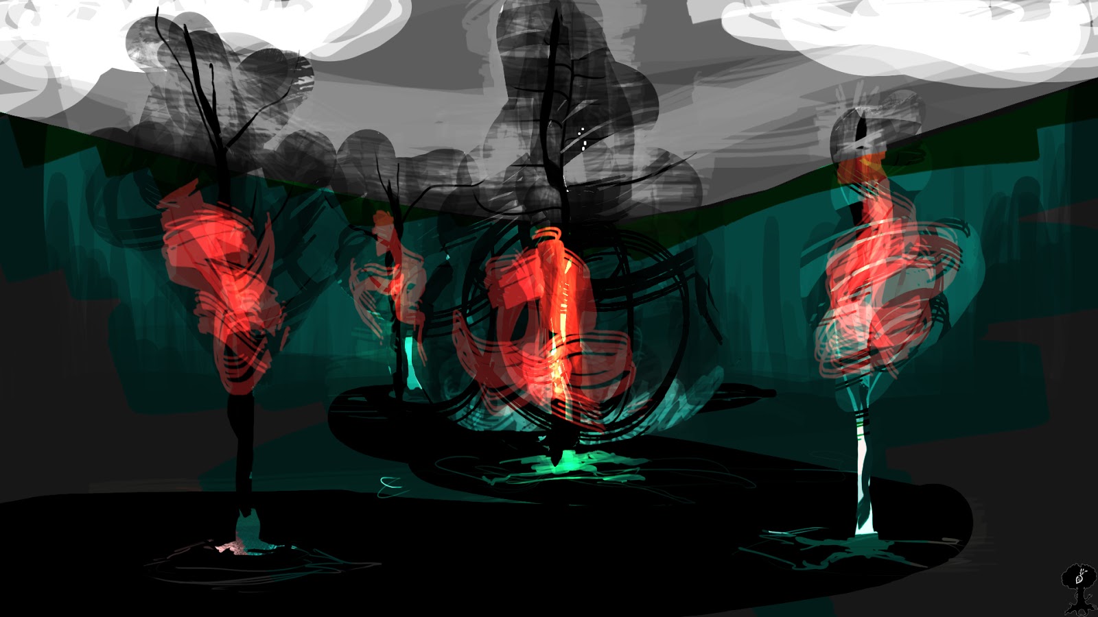
The serpent kingdom takes on more water based colours ranging from blue to purple. I want it to be dark but still beautiful and alluring (the pink and light purples help to bring this out). The bottom two images represent more the atmosphere than colour.

From my tutorials it is clear that I need to take on a specific style. It will help reduce tremendously realistic modelling and will let me concentrate more on texturing, colour and lighting which are the main areas of my interest for this project. So I've decided that a proper style linking Lithuanian folk art and tale would be a wood carved scene where the entirety would seem like a sculpture.

 As the over world of the trees would take on a wooden sculpture theme the serpent kingdom would be more well represented by metal. Still taking on the sculpture aspect, the serpent kingdom will inherit a more rustic charm and combined with the above colour scheme it would make a unique scene.

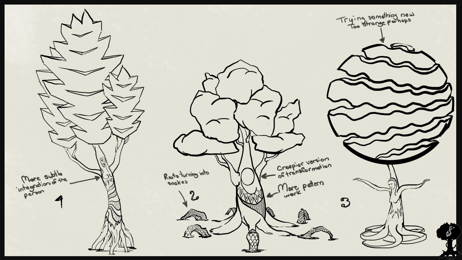
And finally these are the five main trees within the fairy tale. Each representing their own strength and Lithuanian culture outlook. The daughter (aspen tree) is the weakest link within the family so she became a tree that shakes at the weakest wind, so all of the trees are properly situated according to the story.


Friday 8 February 2013

Adaptation: Colour 3

I'm still playing around with contrasting colours but this time around I've put in more detailed brush strokes to accent the tree. The red ambient lighting underneath the tree represents the tragedy of death in the story tying in with the transformation into the tree and at the top a yellow glow representing the innocence.


Adaptation: Colour Experiments 2

I went a little crazy with these but that's all part of experimenting I suppose. The second picture is within the serpent prince's layer looking outward to the entrance. I figure thinking about the inside would also be helpful to my design process.


Thursday 7 February 2013

Adaptation: Colour Experimentation 1

Trying to put together contrasting colours. I feel there's a bit to much colour variation so I'll try to use limited range next painting.


Adaptation: Colour Practice

My main mission now for adaptation is to start getting a colour palette together to set the mood of my scene. While working on the colours I'll also have to set a definitive style of the modelling so that the colours and model style mesh together.
I haven't played around in Photoshop in a while so this is a warm up to get the creative juices going. I'll put together an influence map for my next set of paintings so that the colour scheme is more relevant to Lithuanian art style.


Maya: Curve Emitter Fireworks 1

Wednesday 6 February 2013

Adaptation: Sketches

I've been trying to get a good sense of how my scene will be constructed and mainly the theme of contrast has been showing the most. I have the sacred trees at the top of the structure and towards the bottom where the serpent kingdom is things start to get more chaotic and darker.


With this second drawing I've started incorporating a fortress around the trees adding to the sacred quality as if it were being guarded. The serpent kingdom then continues down to the sea floor as in the first sketch. 

 Here I started working more with pattern (which is prominent in Lithuanian folk art) and give it more purpose. Towards the top there is symmetry and order while towards the serpent kingdom disorder.


After my latest tutorial with Phil it's clear that I need to start working on colour and setting the mood since my main goal is high quality textures and lighting. Also we talked about the scene being too much as a whole and that I should cut down on modelling or find a stylistic approach that can go around it. So my project direction from here will be, while working on finalising the design style, to create colour palettes and also figure out exactly how much I want/need to model.