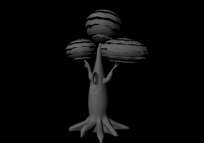
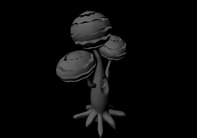
The initial model has it's eyes open but since then I've decided to shut them like they'd be in a slumber.
Tuesday, 26 March 2013
Adaptation: Face Modelling 1
For each of my trees I need the face of the its respective child and woman. I've modelled out the first face focusing on making child-like features like chubby cheeks. I'll use it a a base model for the rest of the faces just changing them slightly so they're not all the same. Also they might be a bit too smooth for the style I'm going for so after I smooth them I'll experiment with hardening edges in certain places to make it seem more wood-like.
Adaptation: Tree Modelling 4
Modelling for the first tree is nearly done, just some refinement needed here and there. The canopy turned out better than I expected, it should look good once lit and textured.
Thursday, 21 March 2013
Wednesday, 20 March 2013
Adaptation: Tree Modelling 3
Getting there bit by bit, just need to tweak a few things and then I can move onto the face and canopy.
Tuesday, 19 March 2013
Sunday, 17 March 2013
Adaptation: Tree Modelling 2
I'm now adding in more polygons and pushing in more detail. The non-smoothed version still looks very jagged and rough but since the scene is meant to look like it's carved from wood that might work in my favour. Once the trunk is finished the canopy should be pretty simple to model out.
Friday, 15 March 2013
Adaptation: Tree Modelling
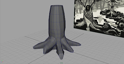
Howdy, nothing too interesting going on at the moment visually like photoshop concept art, just thought I'd post up a little bit of progress. I've dipped my toes into maya and started modelling my first tree. First attempt went sour as I tried to use a high poly model to begin with (big no-no) and now I've begun with a lower poly that hopefully have a brighter future.
#1 - :(
#2 - better
#3 - smoothed
More to come real soon
Wednesday, 13 March 2013
Monday, 11 March 2013
Saturday, 9 March 2013
Adaptation: Finessing the Final Design
Ok, I think I'm finally at the end of my Photoshop conceptual stage. The fortress was determined to be a failure, however, something was still needed to hide the infinite horizon. At the interim crit Phil suggested using the roots of the trees growing outward to form a wall; well since the roots of my trees were turning into snakes already I used that to make natural monumental snake statues as a wall. It hides the horizon and it's a continuation of the snake root theme.
I've also done an overhaul of the serpent kingdom; the kingdom is unlimited in it's fantasy capability within the fairy tale so I've put a glowing light source for the kingdom as the centre of focus. The mound has holes where the snakes slithering in through. And the tree roots from above form massive snake coils around the mound itself giving it a 'kingdom' look; they're also designed in a sharp fashion to resemble metal since my serpent kingdom's meant to represent metal.
If anyone has any suggestions tell me now because I'm ready to move onto Maya.
I went through quite a few renditions of the roots going downward but finally settled with the snakes because the earlier ones just look too much like spider legs.
I've also done an overhaul of the serpent kingdom; the kingdom is unlimited in it's fantasy capability within the fairy tale so I've put a glowing light source for the kingdom as the centre of focus. The mound has holes where the snakes slithering in through. And the tree roots from above form massive snake coils around the mound itself giving it a 'kingdom' look; they're also designed in a sharp fashion to resemble metal since my serpent kingdom's meant to represent metal.
If anyone has any suggestions tell me now because I'm ready to move onto Maya.
Friday, 8 March 2013
Wednesday, 6 March 2013
Tuesday, 5 March 2013
Adaptation: Design Concept
Here I've taken my final design painting and combined it with my earlier sketch of the overall fortress that encloses the trees. At this stage I'm going to move forward with modelling the trees to get them finished as soon as possible.
Monday, 4 March 2013
Adaptation: Design with Colour 2
This time round I've completely scrapped the gray shaded tone, it just seemed to be distracting me from accomplishing what I set out to do. My strongest point was my colour palette so I restarted this concept with just pure colour.
Friday, 1 March 2013
Subscribe to:
Comments (Atom)


